
Light Room
Increator Company
Editorial, warm, restrained. Think a premium print magazine: generous whitespace, serif display in italic, the palette pulled back to let the content breathe.
A private workspace for our team. Enter the access key to continue.
That key doesn't look right. Try again.

01 — Identity
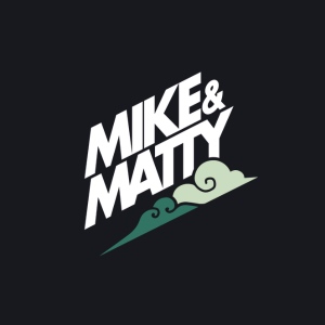
ICC and Mike & Matty share one visual language. The only thing that flips is the mode — ICC reads clean and editorial on cream, Mike & Matty reads cinematic and moody on near-black.
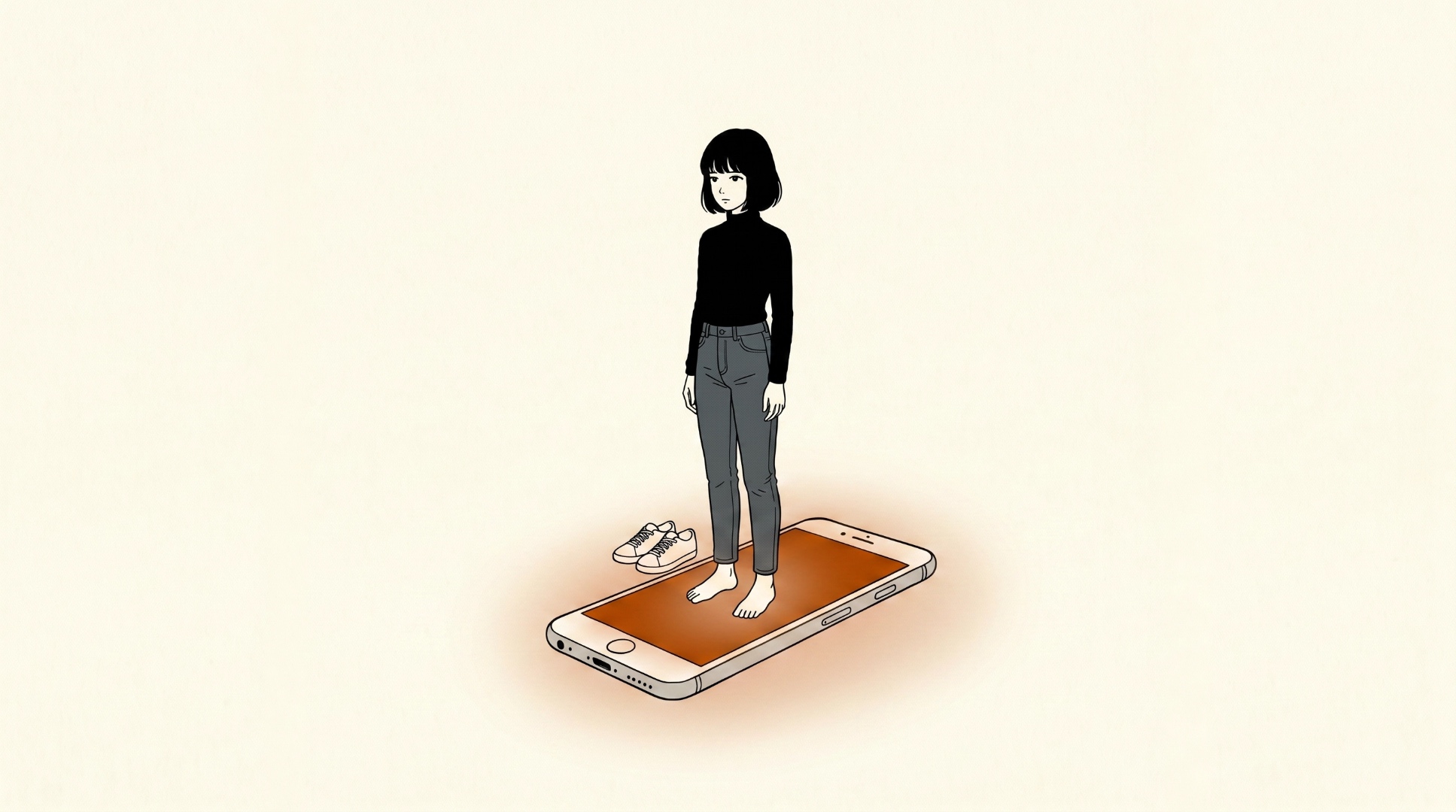
Light Room
Editorial, warm, restrained. Think a premium print magazine: generous whitespace, serif display in italic, the palette pulled back to let the content breathe.
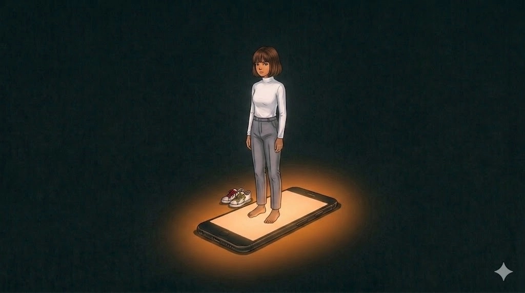
Dark Room
Cinematic, moody, contemplative. Think a documentary opener: deep charcoal field, a single source of light, hand-drawn textures glowing through pencil shade.
We explain the why behind the work — clear, considered, a little contrarian.
Never hype. Never clickbait. Never a 10-word sentence when 6 will do.
02 — Color
Every swatch is a one-click copy. Tier 1 is the foundation — almost every surface lives here. Tier 2 is the warm-earthy supporting cast. Tier 3 is for accents, highlights, and data visualization.
Use these for 90% of surfaces. Buttermilk is the ICC canvas. Pepper is the M&M canvas. Emerald is our brand accent (the glow color).
Warm, earthy, editorial. For section accents, print applications, and richer compositions. Never use more than two at once.
Both rooms run on a monochrome canvas (Pepper or Buttermilk) with one bold accent carrying the moment. Pick the accent by the topic's emotional temperature, not the room. One accent per scene. Never two. Mostly used in motion graphics and storyboard frames to make monochrome + a single accent really pop.
Defaults when in doubt: Walnut for dark rooms (M&M), Carnelian for light rooms (ICC). Never mix tiers — never combine a Tier 2 accent with a Tier 3 brights in the same frame. Never teal anywhere on M&M.
Bright, saturated, friendly. Use for data viz, highlights, badges, and motion-graphic flourishes. Honey is the go-to emphasis color in Mike & Matty lower-thirds.
03 — Typography
Lausanne carries structure, weight, and clarity. Larken adds emphasis and emotion. Every headline pairs the two — a structural phrase interrupted by a single expressive word in Larken italic.
Display · Emphasis
The system for thinking.
Italic for one word of emphasis.
Weights used: Regular 400, Medium 500, Italic.
Body · UI · Structure
Structure is a form of care.
Weights: 300 / 400 / 500 / 700.
Body copy, captions, lower-third descriptors, UI chrome, data viz labels.
Signature pairing
but what most people think is learning
White Lausanne Medium. Honey Larken Italic with a subtle glow behind the emphasis word. The single-word emphasis is the hook — never emphasize more than one word per line.
Pepper Lausanne Medium. Carnelian Larken Italic. The single-word emphasis is the hook — never emphasize more than one word per line.
04 — Canvases
Beyond Buttermilk and Pepper, we have four signature gradient canvases — each a deep saturated color washing into cream paper, with visible film grain. They're the bedrock for editorial covers, video thumbnails, deck title slides, and motion-graphic backgrounds. Each canvas is mapped to a content type so you don't have to guess.
Emerald
Our default canvas. The brand-emerald wash. Use for ICC editorial, strategy decks, motion-graphic halos, and the M&M hero frame.
Navy
For long-form research pieces, technical breakdowns, and any content where you want to signal “studious, considered, after-hours.” Pairs well with white type.
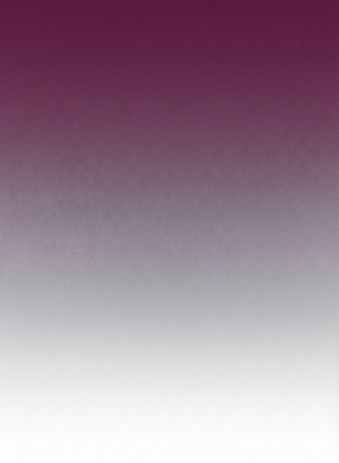
Maroon
Wine-purple wash for narrative-led pieces, founder stories, longform editorial, and end-of-year retrospectives. The most “magazine” of the four.
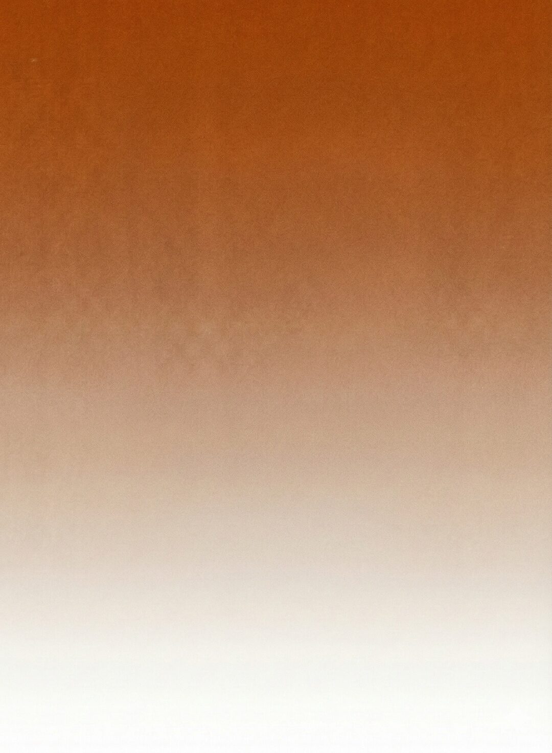
Orange
Carnelian-burnt-sienna wash for personal pieces, behind-the-scenes content, lifestyle and travel posts. The most approachable canvas.
Emerald canvas · grid
The branded backdrop behind on-screen stats, chapter titles, and Frame Studies — emerald vignette with a hairline grid. 3840×2160 PNG. Animated version ↗ drifts slowly; open full-screen and screen-record at 4K.
Keep the paper grain visible. The canvas is paper, not flat color.
Place type in the cream side of the wash where contrast is highest.
Mix two canvases in the same piece. Pick one and commit.
Recreate the gradient from scratch in CSS. Always use the source JPG.
For Style A storyboards and hero illustrations, default to Emerald vignette. It ties Style A to Style B visually so cuts feel cohesive.
Pepper
#211F20 — classic M&M canvas. Use when you want the figure isolated against pure dark.
Emerald vignette · M&M default
#1C2F2C → #0B0D0D radial. Default for storyboards. Gives depth and ties to Style B.
Buttermilk
#FAFAF3 — ICC default and occasional Instagram editorial moments.
05 — Logos
One brand, three logo systems. The wordmark is the universal identity — used everywhere except YouTube. The illustrated sticker mark is the YouTube channel avatar and channel card. The plain Lausanne text is the minimal fallback for footers and captions.
For ICC, decks, PDFs, web, print, and any context where the brand needs to read clean and editorial. Available horizontal and stacked, in four colorways.
Horizontal
Pepper on Buttermilk
Buttermilk on Pepper
Buttermilk on Emerald
 White on photo
Stacked
 Pepper on Buttermilk
 Buttermilk on Pepper
Buttermilk on Emerald
Buttermilk on Pepper
Buttermilk on Emerald
 White on photo
The illustrated hand-lettered mark with the green wave. Used as the YouTube channel avatar and inside channel-card pills only. Never use elsewhere — it's a sub-brand voice, not the universal identity.
YouTube avatar context
Just "Mike & Matty" set in Lausanne — the quietest version of the brand. For email signatures, footers, captions, video lower-thirds, and any context where even the wordmark would be too loud.
Mike & Matty
Lausanne 550 · Buttermilk on PepperMike & Matty
Lausanne 550 · Pepper on Buttermilk
Do Maintain clearspace equal to the cap-height of the "M".
MIKE & MATTY
Don't Distort, skew, recolor off-brand, or add effects.
Do On busy photography, use the white wordmark with a subtle drop shadow.
MIKE & MATTY
Don't Use the sticker mark anywhere except the YouTube channel.
06 — Motion & Storyboards
Style B — Clean Vox UI is the motion-graphics kit: seven reusable components in 2px emerald stroke. Style A — Storyboard plates is the cinematic illustrated workflow: HEIST img2img plates of canonical Matty in real environments. Same brand DNA, two very different jobs.
Style B — Clean Vox UI · Motion graphics
2px Emerald stroke with outer glow. Radial vignette behind. Use for data, process, explainers, lower-thirds — any moment where the geometry carries the meaning. The kit lives at brand.mikeandmatty.com/motion and is screen-recorded at 4K for delivery.
but what most people think is learning
they lack the system
One emphasized word per frame. Italic Larken on sans Lausanne.
One source of light per scene. Let darkness (or paper) do the rest.
Multiple colors of glow in the same frame. Pick accent OR emphasis.
Use flat mode for motion. Use halo mode for motion. Flat is for PDFs.
Export at 4K (3840×2160) for YouTube. Screen-record the HTML kit for animation.
Use canned After Effects templates. If it looks like Envato, it's off-brand.
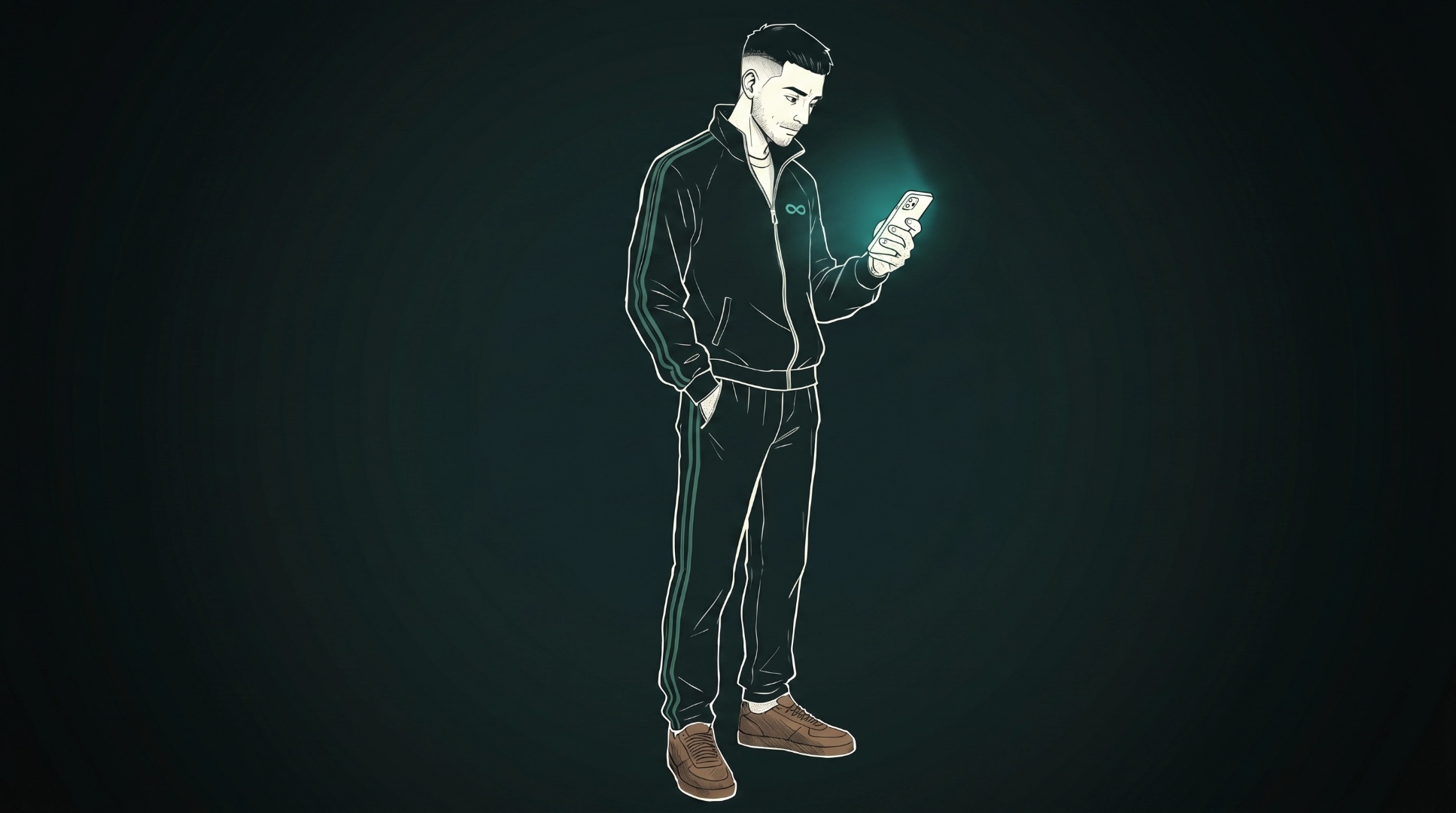
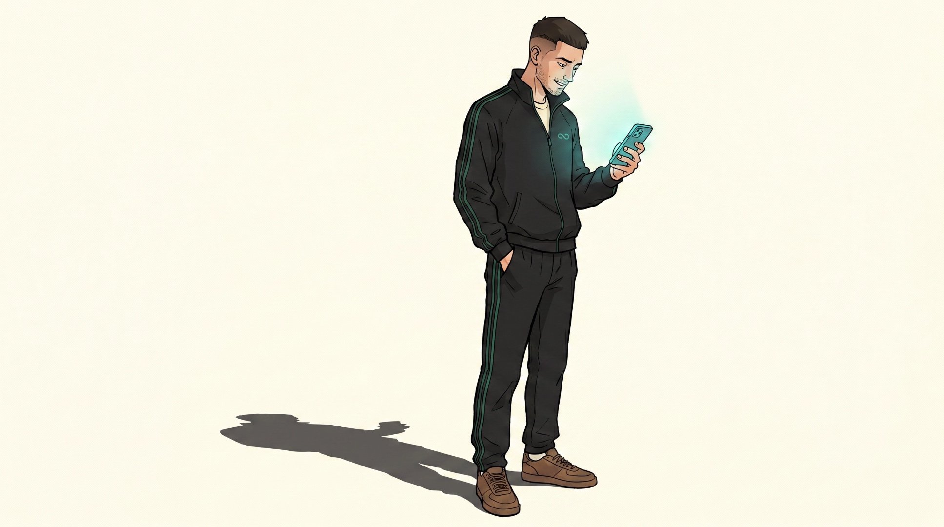
Style A — Storyboard plates · Cinematic illustration
For cold opens, hero beats, and any moment where the meaning lives in atmosphere instead of geometry. Every plate starts as a real reference photo of canonical Matty in a real environment, then HEIST img2img re-renders it. Plates compose into a snap-clip HTML reel and get screen-recorded with named camera moves between shots.
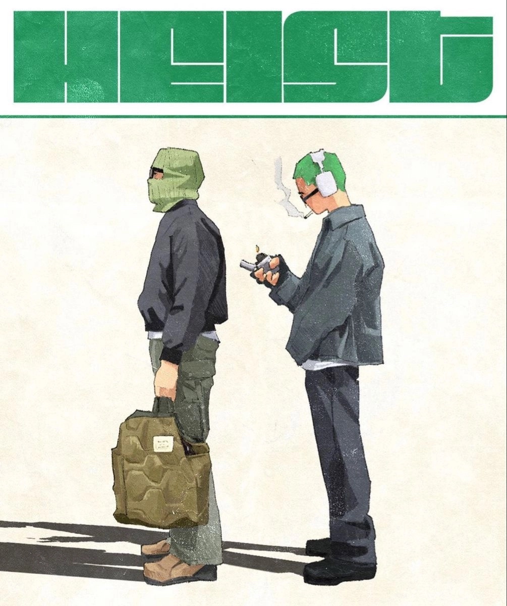
The visual lock
Every Style A plate passes through HEIST as img2img with a real reference photo as the input. No text-to-image plates, ever — that’s the line that keeps Style A from looking like generic AI output. Pencil-shaded line work, soft warm fills, honest paper texture.
01
Reference photo in, stylized plate out. No exceptions. No text-to-image.
02
Single directional key — a window, a lamp, a sun direction. No flat ambient, no multi-source studio looks. Commit to one.
03
Plates are pure illustration. All copy gets added in post as motion graphics over the top.
04
Deep emerald falloff at the edges, brighter center. The dominant Style A look unless the scene calls for Pepper or Buttermilk.
05
Tier 2 accent for Style A in M&M is walnut. In light rooms (ICC), accent is emerald. Never teal anywhere on M&M, ever.
06
Same character across every plate. Denim chore jacket + ribbed white tank by default. Override explicitly when the scene demands it (e.g. track suit for AI Band).
Deep emerald with center falloff. The dominant Style A canvas. Use this unless there’s a specific reason not to.
Pure dark room, flat Pepper background. Use when the scene needs maximum gravity or cold tone. Drowning depths, late-night moments.
Light room variant. Sparingly, for tonal contrast or “after” / resolution beats. ICC defaults here. The drowning-in-content vibe lives in this canvas.
Briefs pull from a shared vocabulary — camera moves, reveal verbs, composition shorthand, and the four narrative arcs (Drowning, Reveal, Descent, Discovery). Vocabulary is maintained internally and lives on the brand hub.
Generate text-to-image plates. Every plate is HEIST img2img.
Put on-screen text inside a plate. Editor adds copy in post.
Use teal accents anywhere on M&M. Walnut for dark, emerald for light.
Mix tiers in the same plate — walnut and emerald together is wrong.
Light flat or with multiple sources. One directional key, every time.
Dress Matty off-canon unless the scene explicitly calls for it.
Three storyboards built under these rules, all live. Open them on a laptop — they’re snap-clip reels with named camera moves between plates. Toggle the room above to see each storyboard’s dark (M&M) and light (ICC) variant.
Style A · Reveal arc
5 plates, swap canvas per channel — Pepper for M&M, Buttermilk for ICC. Push → pull → drift → push → rise.
View live →
Style A · Descent arc
Monochrome canvas + single accent. Pepper room glows warm; Buttermilk room runs carnelian. Surface → deep → floor → reach.
View live →
Style A · Iceberg arc
Iceberg metaphor, descent reveal. Surface → systems → foundation. Persistent SVG holds across acts.
View live →
07 — Motion Primitives
A growing library of multi-clip motion shapes — venn, bars, line graphs, funnels, pyramids, matrices, spectrums, timelines, flywheels, plus an editor-style text layer for headline + emphasis word + caption. Each is a parameterized HTML scene that records cleanly clip-by-clip at 4K. No copy is baked into the shape primitives, so editors stay free to type-set their own in Premiere or DaVinci.
2 or 3 circles, horizontal bowtie or equilateral.
3–7 bars · ascending, descending, or wave.
4–8 points · rise, fall, wave, J-curve.
3–4 stages · closed stack or open V.
3–4 tiers · base up or top down.
Axes + boxes, or axes-only mode. Quadrants ignite in order.
1D scale · marker or range, optional end poles.
3–6 phases · dot + line builds dot-by-dot, optional current-state ring.
3–6 nodes · each clip reveals a node + its outgoing arc.
Lausanne headline + Larken italic emphasis word + uppercase caption. The only primitive with copy.
Template builder
Pick a shape, set the parameters, screen-record clip-by-clip. Every primitive supports dark M&M and light ICC canvases plus auto / emerald / honey / carnelian stroke recipes. Shape sub-filters expose the variants — matrix axes-only, funnel open V, spectrum range, timeline current-state, flywheel direction, and text position + animation.
08 — Thumbnails
Thumbnails are where editors most often go off-brand. The rules are simple: one subject, one emphasis word, one source of light. Never more.
Cinematic library photo, 3–4 word headline in Lausanne 550 white with one Larken Italic emphasis word in Honey. Headline on top-third or bottom-third over the body — never on the face. Optional channel-card pill with the sticker mark. When the photo carries the whole idea — a strong expression, a charged moment, an unusual composition — drop the overlay and let the image do the work (use sparingly, ~1 in 5). Drag any slider to see the before / after grade.

Text grid: 3–4 words max. Place on top-third or bottom-third, never on the face.
Emphasis word in Larken Italic, Honey #FAC53A. Rest in Lausanne 550, Buttermilk.
Never all-caps. Never stroke outlines. Never full sentences.
YOU WON'T BELIEVE THIS!!!
How to think better about many things at once
watch this NOW
Mind Blown Truth
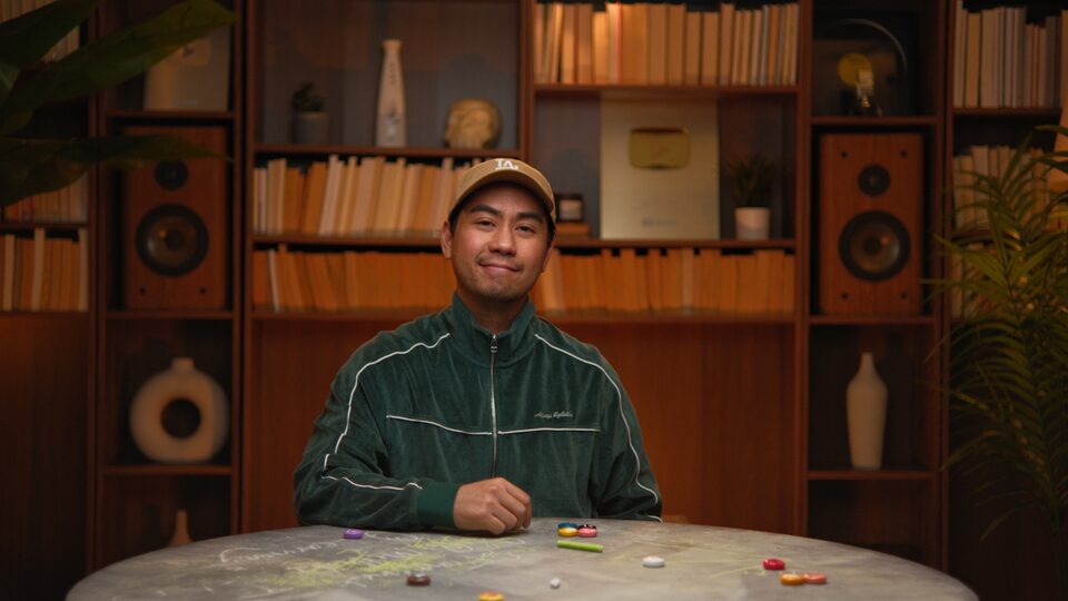
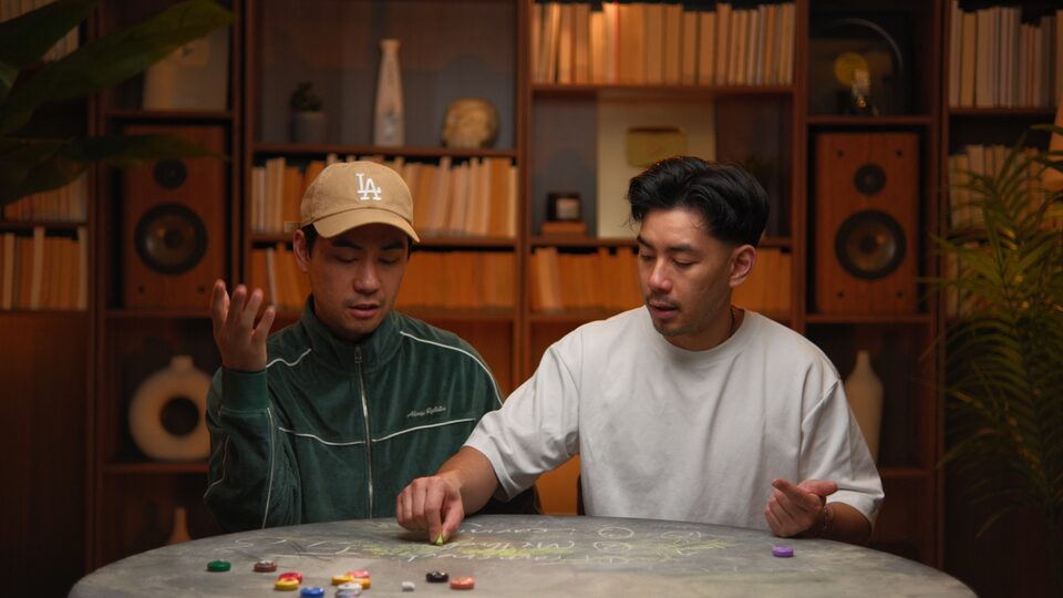
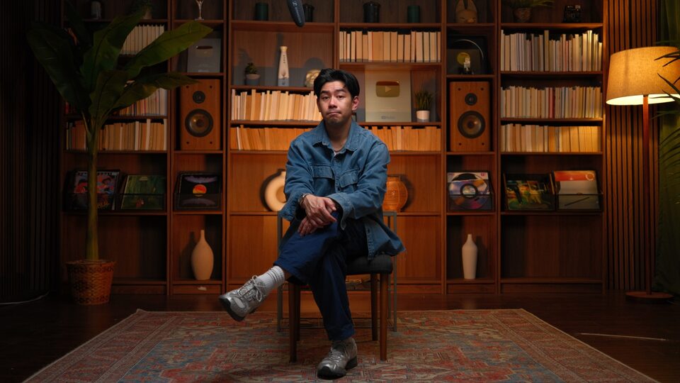
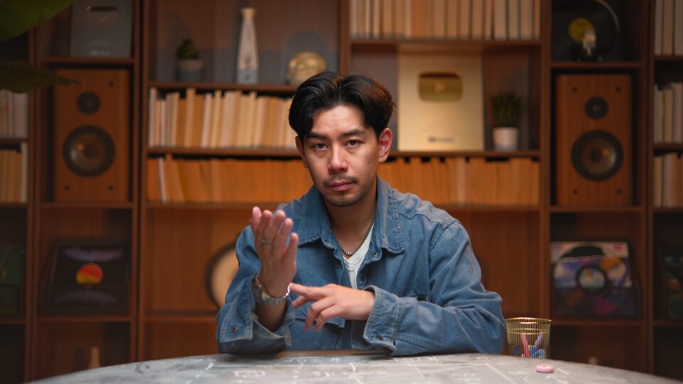
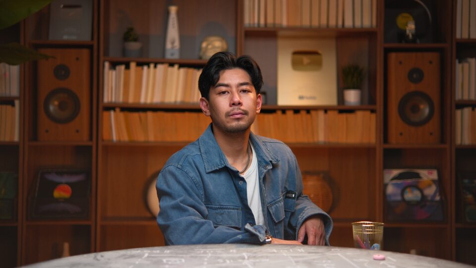
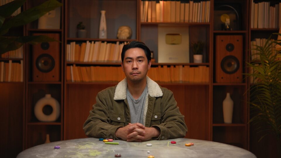
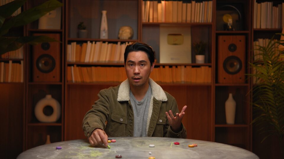
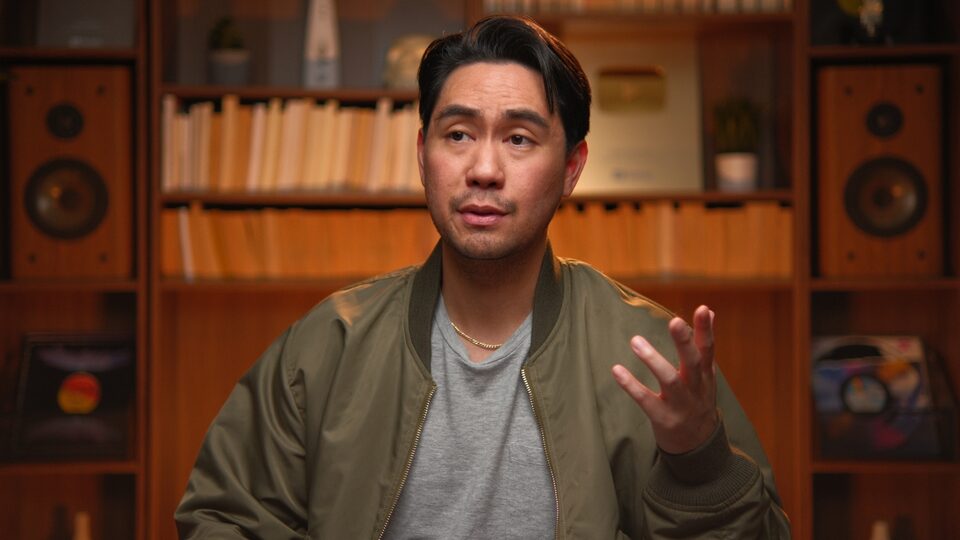
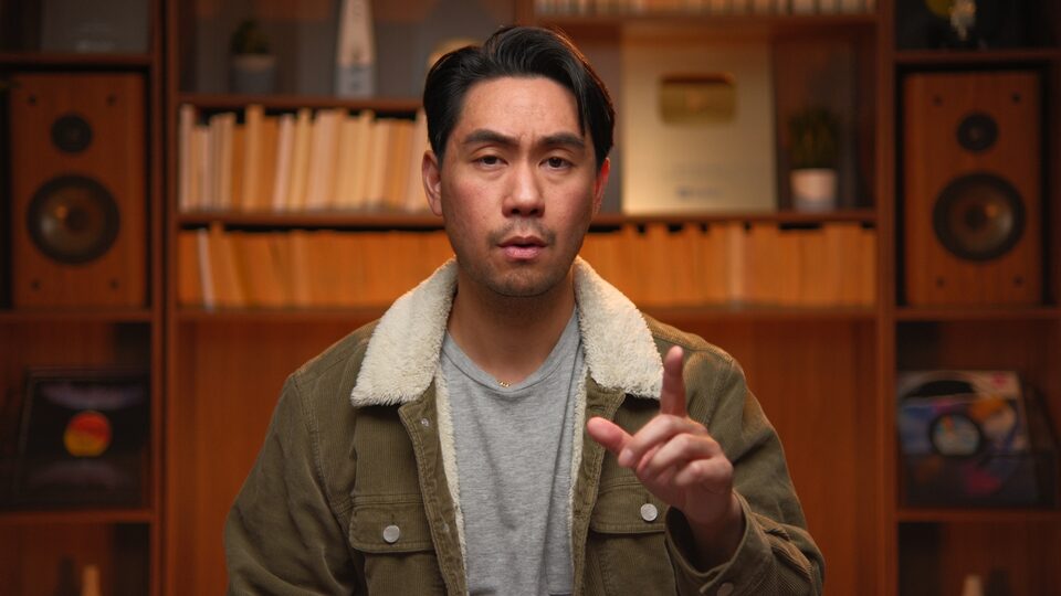
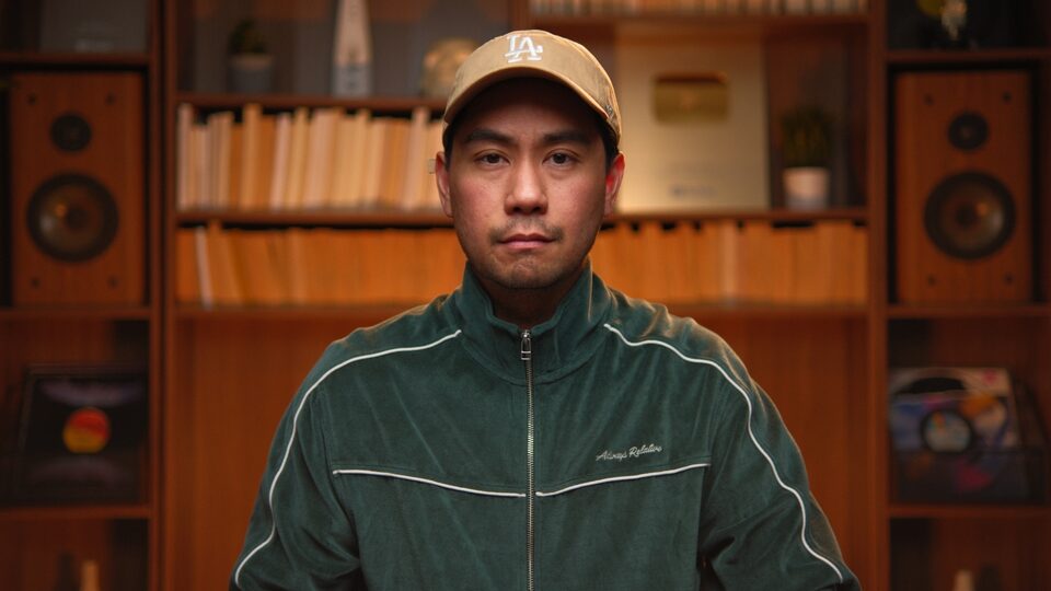
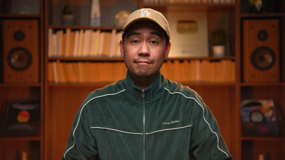
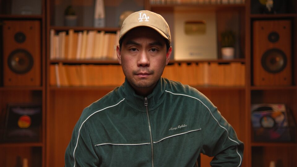
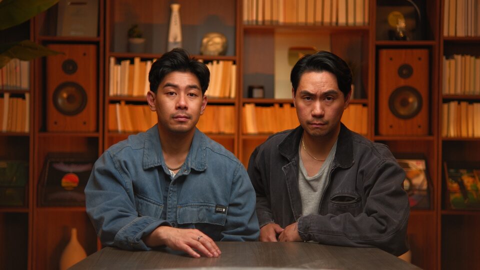
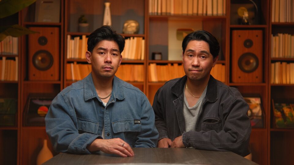
09 — Photography
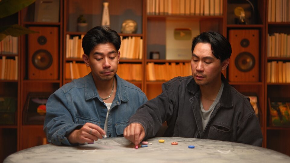
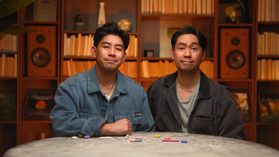
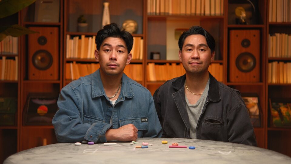
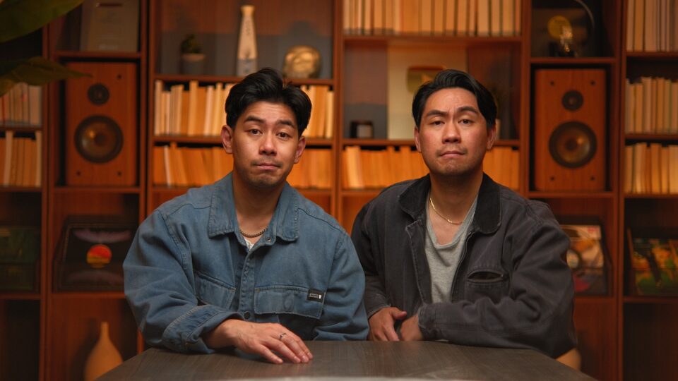
Our visual identity isn't only logos and type — it's a specific room, a specific wardrobe, a specific lighting recipe. Library shelves, vintage hi-fi, plants, denim, tungsten warmth, teal-black shadow. The set is itself a brand asset.
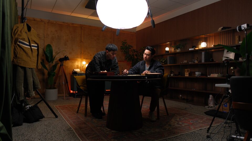
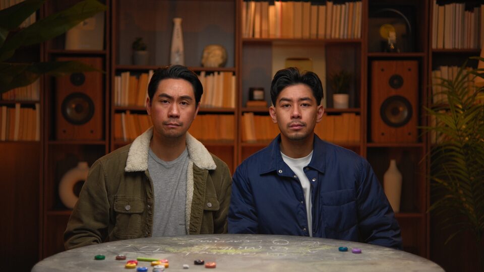
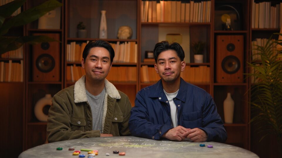
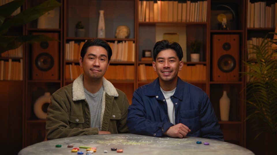
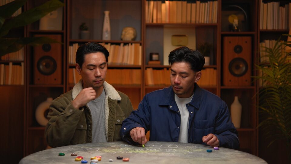
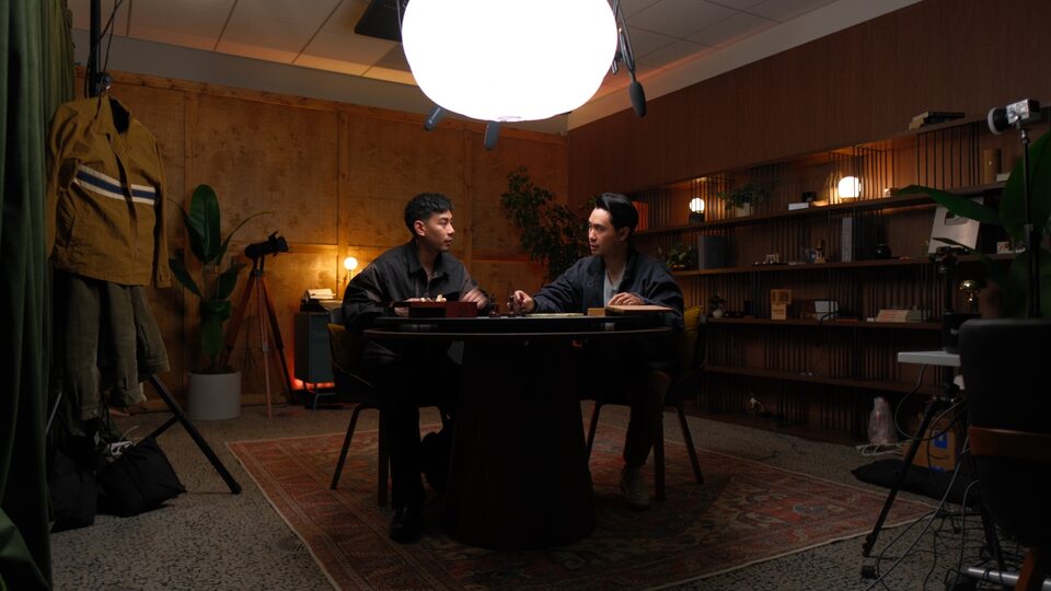
The studio
Plywood walls, Persian rug, slatted shelving, big diffuser globe, hanging vintage workwear, vintage tripod with film camera. Two configurations: the close-up library set, and this wider studio frame.
Set
Library room. Warm-wood floor-to-ceiling shelves, paperbacks shot edge-on, vintage hi-fi speakers as symmetry anchors, vinyl, plants, ceramic vases, the silver YouTube plaque.
Lighting
Single warm key from camera-right at ~30°. Tungsten highlights, teal-black shadows. Practical lamps as ambient fill. Subtle film grain in shadows.
Wardrobe
Earthy workwear. Denim chore jackets, olive sherpa, emerald velour track jacket, charcoal canvas, grey crewnecks. No brights. No logos beyond their own pieces.
Camera
Eye-level, ~50mm feel. Medium-shallow depth of field. Subject sharp, room readable but soft. 16:9. Direct-to-camera or angled at the chalk-table.
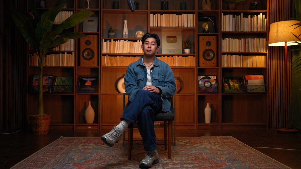


Use the wide-vibe shots as hero images on websites and decks. The room sells the brand.
Use library close-ups for thumbnails. Tight crop, neutral expression, direct-to-camera.
Use the chalk-table duo shot for About pages, bios, and partnership decks.
Crop the photos to remove the room. The room IS the brand.
Apply heavy filters, B&W, or duotone. The existing color grade IS the look.
Add stock textures or graphic overlays on the photos. The photo is the design.
10 — Applications
The system scales from a 16:9 slide to a vertical carousel. Here are the patterns.
01 / 12
Creator decisions, explained.
Mike & Matty · 2026Slide · 16:9
Stop posting.
Start thinking.
Swipe →Carousel · 1:1
Output vs input
Infographic · 4:3
Jesse Increator
FOUNDER · MIKE & MATTY
Lower-third · 16:9
On-Screen Graphics
PLAYBOOK · OVERLAYS · TITLES · SHOWCASE
Video overlay templates — lower-thirds, titles, definitions, and the projected showcase, in both the M&M dark and ICC light rooms.
11 — Downloads
Logos in four colorways, the headshot library in Canva, the canvas gradients, the color palette in Adobe Swatch format, and the approved thumbnail reference set — everything you need to ship work that's on-brand.
Adobe Swatch Exchange (.ase) + JSON + CSS variables
Download →Wordmark SVGs (4 colors, horizontal + stacked) + sticker mark
Download →Mike & Matty headshots in Canva · always-current set
Open in Canva ↗Reference set of approved Mike & Matty thumbnails
Download →Emerald, Navy, Maroon, Orange paper-gradient JPGs
Download →The brand background — 3840×2160 PNG. Behind full-screen titles & stats. SVG source in the repo.
Download →Same canvas with a slow drift. Open full-screen, press R, screen-record at 4K.
Open ↗Editors always get these wrong. One tap = copied to clipboard.