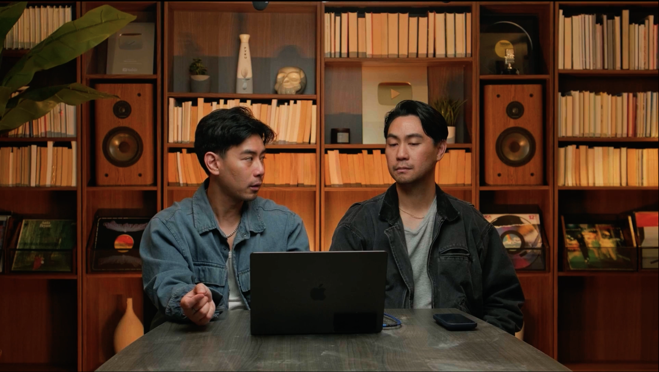
A reference gallery for editors. Each entry takes a real frame and rebuilds it to the system — same concept, same message, corrected execution. The recurring fixes: our controlled stroke-glow instead of a soft bloom, one consistent line system, a calm room, and Lausanne carrying the copy with a single Larken accent. Drag any handle to compare.
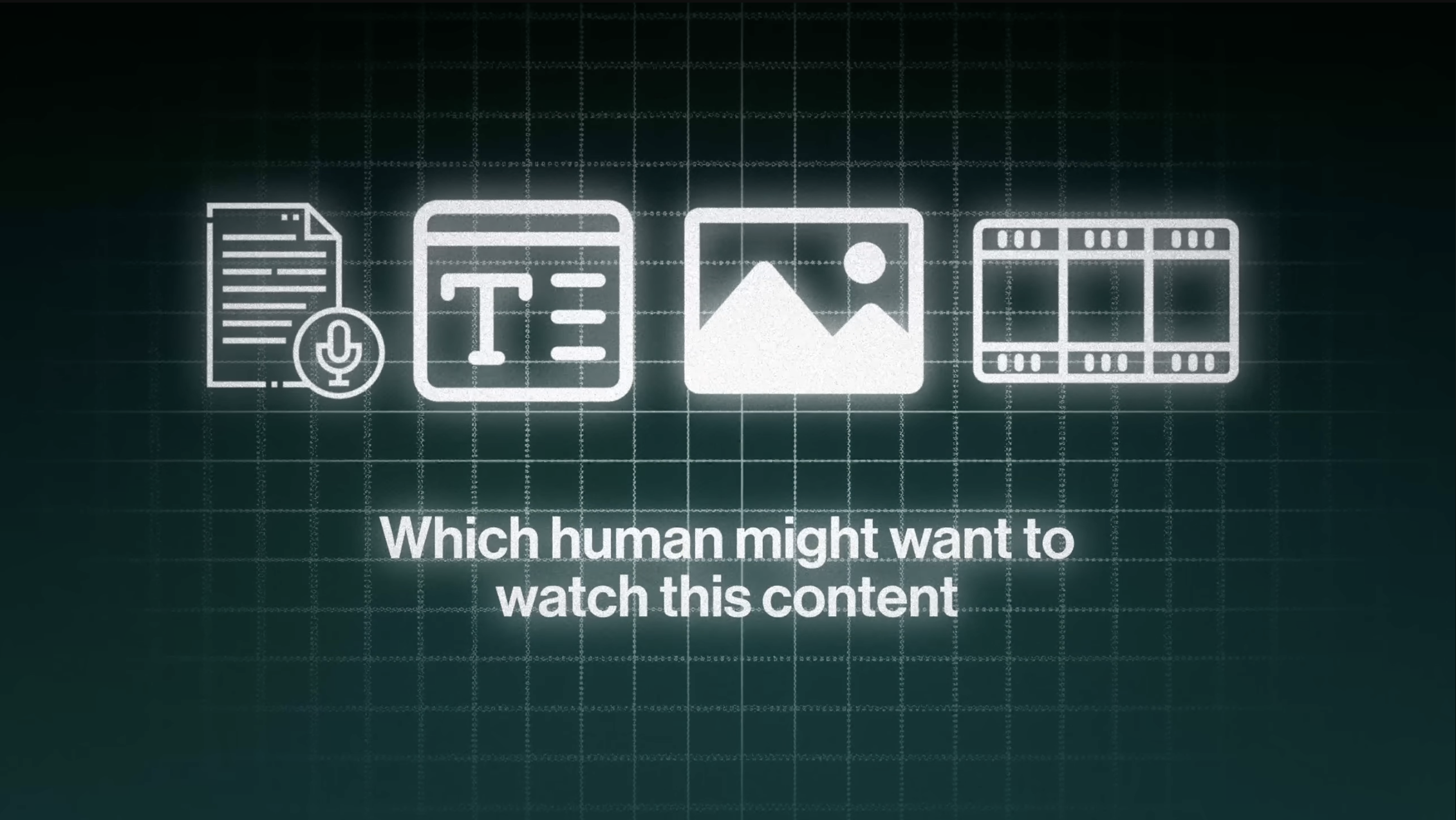
01 Content types → human intent
Which human might want to watch this content
After · On-brand
Before · Editor draft
⇄
What changed, and why.
Six moves take it from "looks like the brand" to "is the brand." Each maps to a bright-line rule in the system.
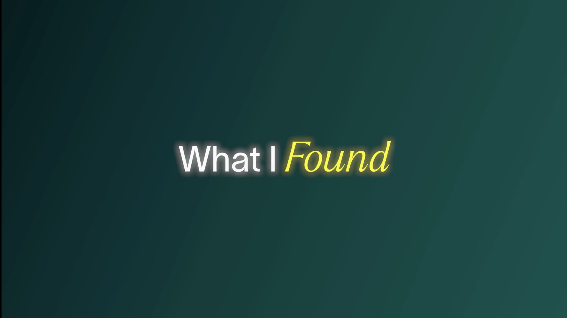
01
Glow, not bloom
BeforeSoft blurred halo bleeding off every shape — reads as a filter, not a finish.
The structure was right — short title, one word emphasised. The glow and the yellow were wrong.
01
Kill the glow
BeforeA thick white outer-glow ringing every letter — reads as a default text-effect preset.
AfterCrisp Lausanne on the dark field. The canvas gives the contrast, not a halo.
02
Honey, not lemon
BeforeAn electric lemon-yellow on "Found" — wrong hue, and double-glowed.
AfterLarken italic in honey on "found" — the one warm gesture, exactly as the system specifies.
03
Larken for the accent only
Before"Found" was a generic bold italic, not our serif — the accent loses its signature.
AfterLarken on the accent word, Lausanne on the rest. The contrast is the brand.
04
Even baseline
BeforeWords sat at slightly different weights, floating.
AfterOne line, one baseline, centred — the title reads as a single unit.
06 Title with an emphasis underline
How the algorithm currently works
After · On-brand
Before · Editor draft
⇄
A straight rule, not a scribble.
Underlining the key word is a good instinct. The hand-drawn marker scribble is the tell.
01
No hand-scribble
BeforeA wobbly marker-scrawl underline — the single most common "off-brand creator" move.
AfterA clean honey rule, even weight, sitting on the baseline. Deliberate, not doodled.
02
Underline one word
BeforeThe scribble ran under a whole phrase — the emphasis blurs across too much.
AfterThe rule sits under the one load-bearing word: currently. One idea, one mark.
03
Right hue, used once
BeforeBright yellow type and a bright yellow scribble — the accent is doubled.
AfterWhite Lausanne, one honey rule. Colour appears exactly once.
04
Calm the field
BeforeFlat green slab, no depth.
AfterEmerald vignette + hairline grid — the canvas has a centre.
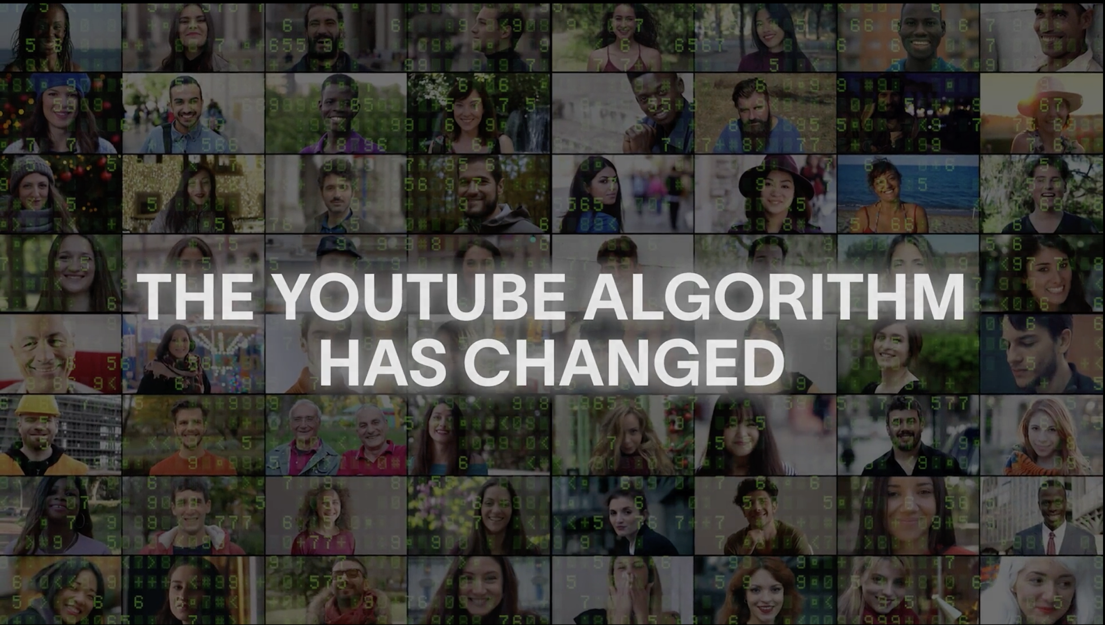
07 Cold-open statement
The YouTube algorithm has changed
After · On-brand
Before · Editor draft
⇄
Borrowed stock vs. our own restraint.
This is the big one. The idea is fine; almost every visual choice fought the brand.
01
No stock collage
BeforeA grid of stock-photo faces — generic, busy, and nothing to do with Mike & Matty.
AfterThe empty brand canvas. Confidence is the message standing alone, not a wall of borrowed people.
02
Lose the "matrix"
BeforeFalling-code matrix numbers over the faces — a tired effect that signals "tech cliché".
AfterOur quiet hairline grid carries the "system" idea without the costume.
03
Sentence case
BeforeShouting ALL-CAPS in a heavy slab — aggressive, and hard to read at a glance.
AfterSentence case in Lausanne, one Larken accent on "changed". Calm carries more weight.
04
One accent, one idea
BeforeWhite box behind the text, grey faces, green code — three competing colour stories.
AfterCream type, one honey word, emerald field. A single, legible point of view.
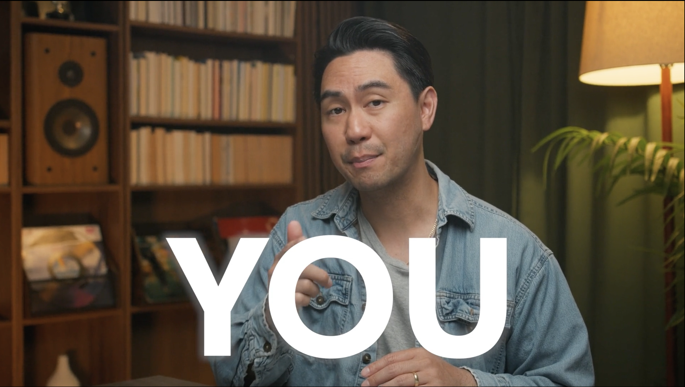
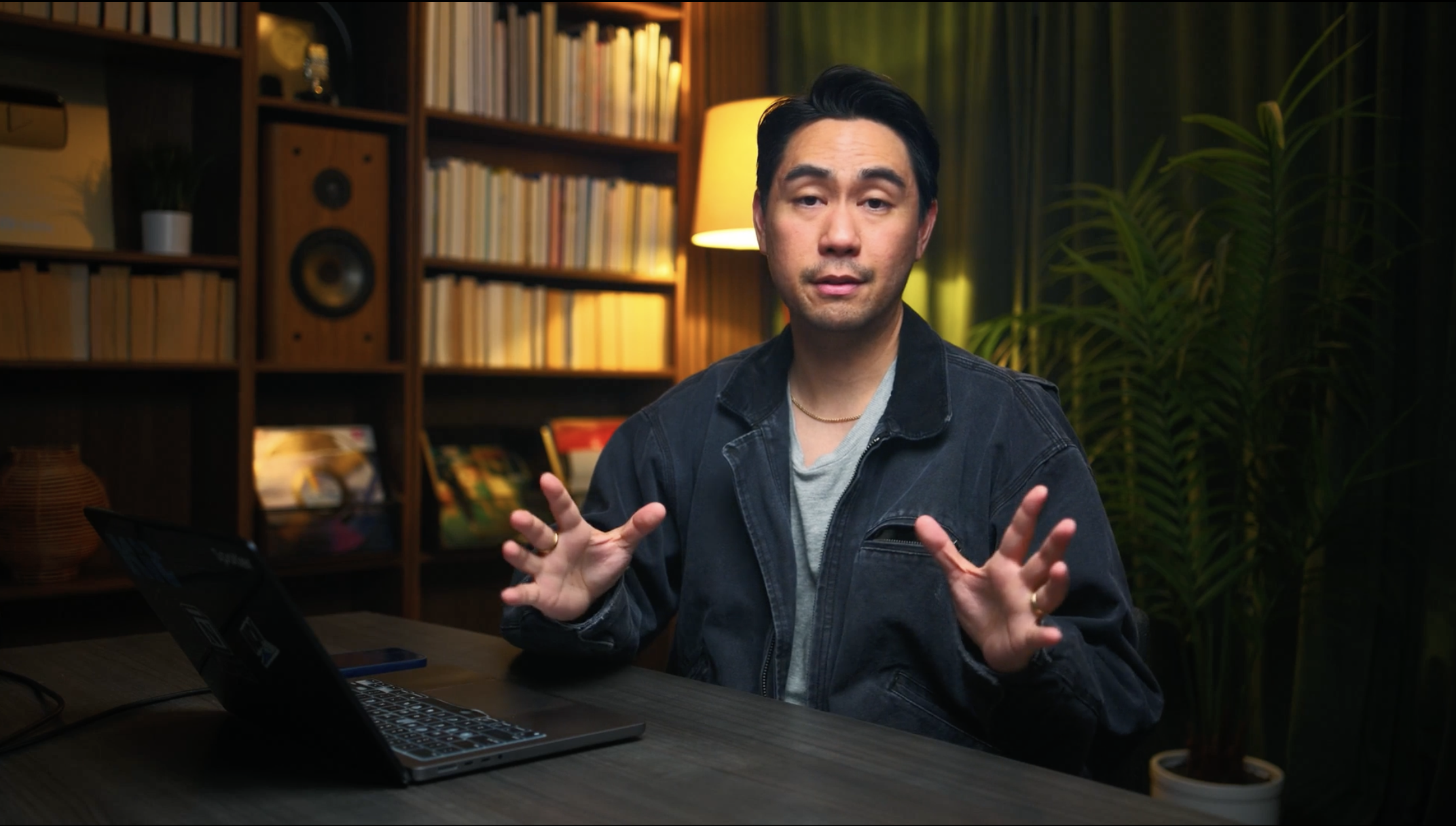
08 On-footage · does this even need text?
No graphic.Let the moment land.
After · On-brand
Before · Editor draft
⇄
The best graphic is sometimes none.
A punch word stamped on a close-up usually means the editor didn't trust the moment. The most premium move is to ask first — does this line need text at all?
01
Restraint is a decision
BeforeA giant "YOU" manufactured over the close-up — reaching for emphasis the cut should already carry.
AfterNothing. The delivery, the eye contact, the pause do the work. Confidence reads as silence on screen.
02
If not text, then what
BeforeText used as a crutch — the default when a beat feels flat.
AfterCut to b-roll of the thing you're describing, or hold the performance. Show it; don't label it.
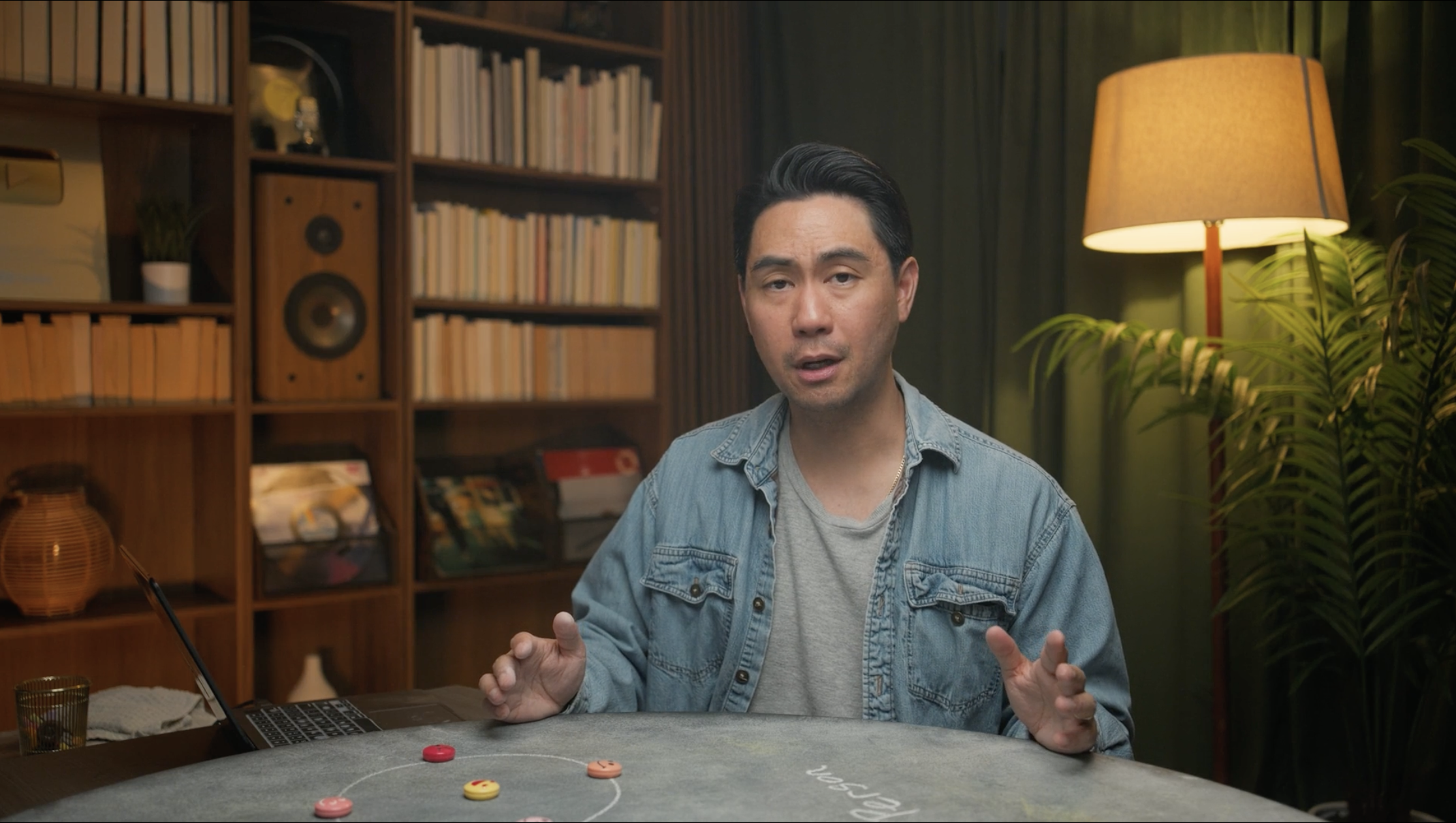
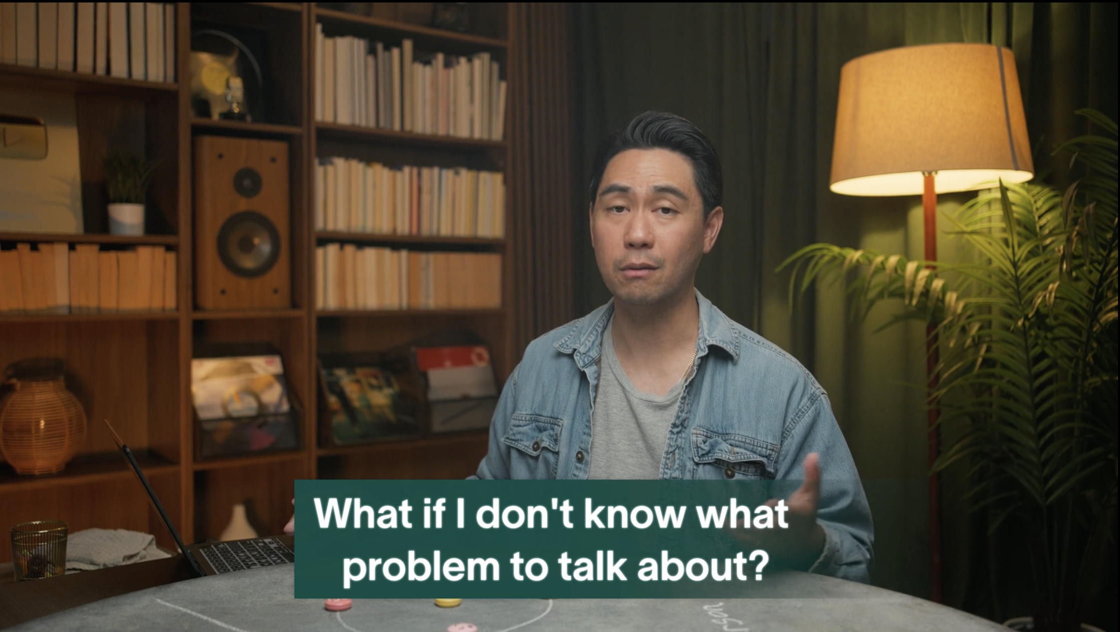
09 On-footage · the subtitle
What if I don't know what problem to talk about?
After · On-brand
Before · Editor draft
⇄
The caption rides the light, not a box.
Spoken-word captions should sit on the footage, not in a plastic container on top of it.
01
Scrim, not slab
BeforeA hard rounded box punched over the shot — opaque, heavy, fighting the room.
AfterAn emerald highlight hugging the words on a soft bottom scrim. Reads instantly, stays in the world.
02
One block, centred
BeforeGeneric bold sans, no system.
AfterLausanne 550, bottom-centre — the on-screen-graphics subtitle template.
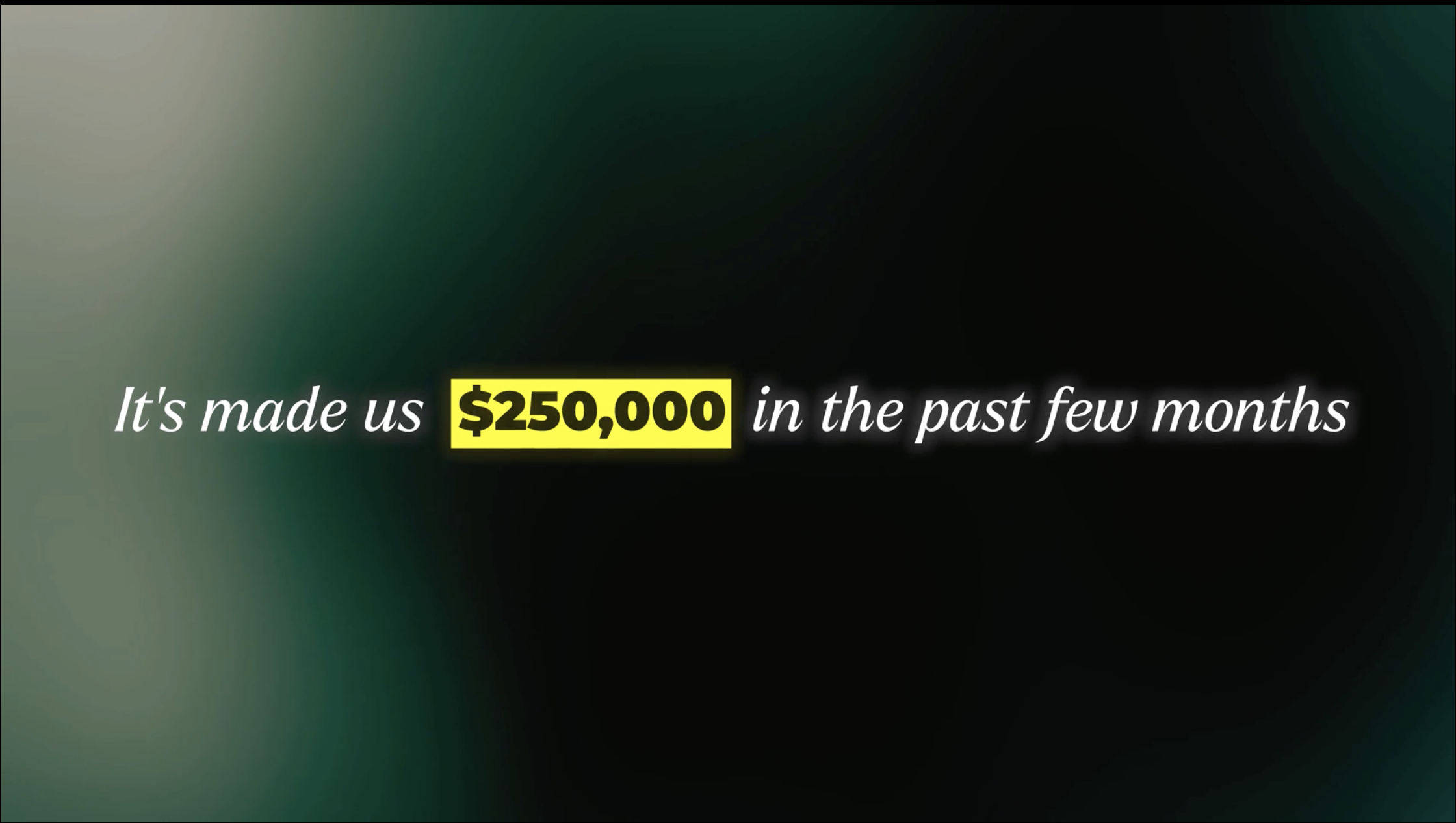
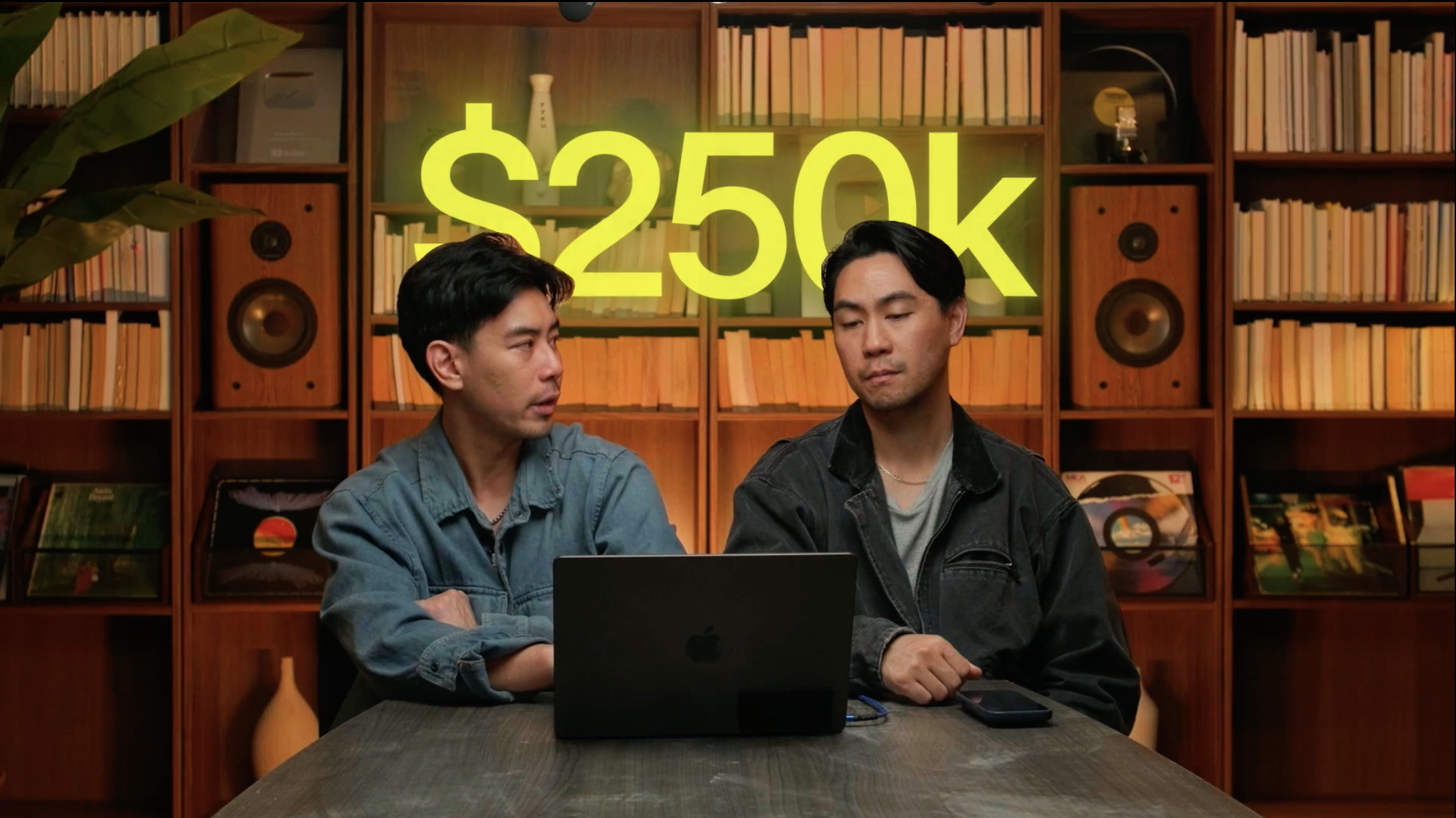
10 On-footage · the big number
In the first quarter
$250k
After · On-brand
Before · Editor draft
⇄
The number lives in the foreground.
A big stat is a poster moment — it belongs in the open frame, not floating in the bookshelf behind them.
01
Honey, not highlighter
BeforeAcid lime-yellow — a colour that isn't in our palette — glowing on the back wall.
AfterThe figure in cream with one honey unit. Brand colour, one accent, low-left in the open foreground.
02
Anchored, not floating
BeforeText pinned to the shelf behind the hosts — reads as set dressing, competes with their faces.
AfterSat on the table-level negative space with a soft scrim. It owns the frame without crowding anyone.
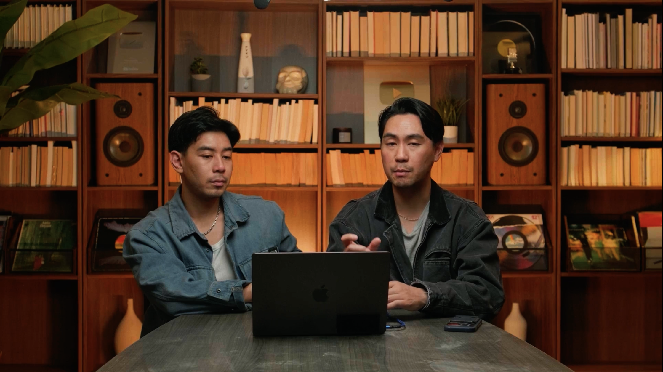
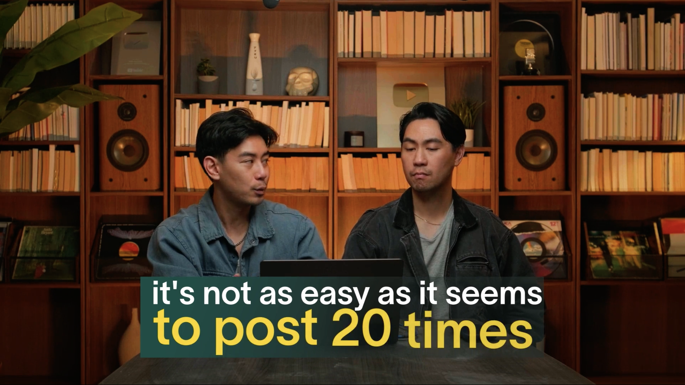
11 On-footage · the two-shot caption
It's not as easy as it seems to post 20 times.
After · On-brand
Before · Editor draft
⇄
One highlight, one colour.
The instinct to highlight the caption is right — but the number doesn't get its own clashing colour.
01
Emerald only
BeforeA green highlight on line one, then a yellow number block on line two — two systems fighting.
AfterOne emerald highlight across the whole line. The number sits in the same flow — no second colour.
02
One block, centred
BeforeTwo stacked bars at different widths — ragged, two-tone, busy.
AfterLausanne 550, one centred block on a soft scrim — the subtitle template, holding a two-shot just as well.
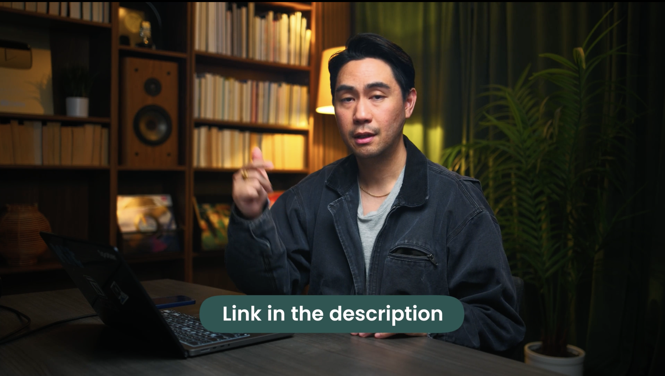
12 On-footage · the call-to-action
Link in the description
After · On-brand
Before · Editor draft
⇄
A prompt, not a pill.
Calls-to-action should feel like part of the film, not a button bolted onto the frame.
 Before · Editor draft
 Before · Editor draft
 Before · Editor draft
 Before · Editor draft
 Before · Editor draft
 Before · Editor draft
 Before · Editor draft
 Before · Editor draft
 Before · Editor draft
 Before · Editor draft
 Before · Editor draft
 Before · Editor draft